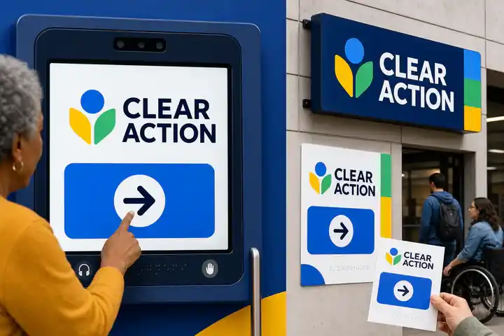
01 / Overview
Feels direct, inclusive, public, with a deliberate rather than generic personality.
Signature move
Oversized labels and icons become the brand while preserving exact hierarchy and redundancy.
- Intensity
- assertive
- Versatility
- 5 / 5
- ID
accessible-bold-utility
02 / Example art
Accessible Bold Utility
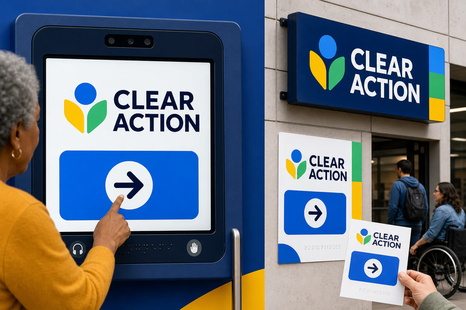
Original artwork establishes the direction's visual language before it is translated into an interface.
03 / Website example
Try the page as a working experience
Explore this responsive page directly inside the catalog. Its primary navigation, controls, and interactions are live; open it full screen to experience the original composition.
Examples are in production
The direction is available now. Its brand websites are being built as independent sites and will appear here during local production.
04 / Fit
Suitable for
Suitable for
public service / education / transport / retail / healthcare / utilities
Business goals
act / orient / include / understand
A strong choice when
Strong when public service, education, transport, retail need to act, orient, include through a memorable but repeatable visual system.
Avoid when
Avoid when the brief needs complete visual neutrality or when this direction would compete with essential information and actions.
05 / Design system
Design system
Rules that should remain coherent as content, devices, and business needs change.
- 01Composition
- Large targets, short paths, explicit grouping, persistent orientation, and robust reflow at extreme text sizes.
- 02Hierarchy
- Make the signature move the first organizing decision, then reveal supporting information through stable scale, alignment, and sequence.
- 03Typography
- Open durable type with generous x-height, strong weight hierarchy, and no essential all-caps passages.
- 04Color
- High-contrast multi-hue system with text, icon, shape, and label redundancy for every state.
- 05Imagery
- Clear explanatory images and inclusive real-world representation with useful alt text and captions.
- 06Material
- Signage, painted fields, tactile markers, and sturdy controls communicate function at distance and touch.
- 07Motion
- Optional, brief, and never required; focus, status, and progress remain perceptible without it.
Adaptation
Keep the signature move invariant. Adapt imagery, material, language, and interaction to the actual public service, education, transport context rather than copying a finished reference.
Accessibility
Use progressive disclosure, stable alignment, and generous line spacing for dense information. Meet WCAG AA contrast, visible focus, 44px targets, and never encode meaning through color or style alone.
06 / Background
Background
These lineages are source-linked research doors, not permission to copy a particular work or brand.
- 01uswds
- 02nhs design system
- 03supergraphics
- 04mexico 68
Guardrail
Test with disabled users and real assistive technology; boldness does not substitute for semantic access.
07 / Agent recipe
accessible-bold-utility
Use the stable ID and recipe to give design agents the same context. Always adapt the output to the real business.
Prompt recipe
Use case: stylized-concept
Asset type: Aesthetic Directions Encyclopedia showcase, 3:2 landscape master
Primary request: Create one polished freeform showcase for Accessible Bold Utility, applied to CLEAR ACTION, a clearly fictional inclusive public benefits portal.
Scene/backdrop: a bold high-contrast service portal, public kiosk, and printed notice centered on one unmistakable accessible action.
Style/medium: A coherent contemporary design world, not a collage of references. Make accessibility visible as confidence, speed, and identity rather than a quiet compliance layer.
Composition/framing: Large targets, short paths, explicit grouping, persistent orientation, and robust reflow at extreme text sizes. Keep all important content inside an 8 percent safe margin.
Typography: Open durable type with generous x-height, strong weight hierarchy, and no essential all-caps passages.
Color palette: High-contrast multi-hue system with text, icon, shape, and label redundancy for every state.
Imagery: Clear explanatory images and inclusive real-world representation with useful alt text and captions.
Materials/textures: Signage, painted fields, tactile markers, and sturdy controls communicate function at distance and touch.
Text (verbatim): "CLEAR ACTION". No other readable words.
Constraints: Original fictional concept; visibly applied to ui, website, environment; realistic production detail; no real company, client, result, claim, signature, or watermark; no imitation of a living artist or proprietary campaign.
Avoid: accessibility mode as a separate inferior skin, color-only state, oversized type that destroys hierarchy, real logos, watermarks, artist imitation, generic mood board, illegible filler text.
Pilot refinement: Make one dominant integrated real-world application readable at thumbnail scale. Secondary views may support it but must remain subordinate. Do not create an equal-weight tiled mood board or generic presentation collage unless sequencing is essential to the direction. Render the exact requested text correctly and do not invent other readable copy.
Working constraints
- Use one coherent direction grammar, not a collage of style references.
- Use only a fictional business and minimal exact text.
- Do not imitate a living artist, real brand, client project, or proprietary campaign.
- Preserve essential hierarchy, legibility, contrast, and reduced-motion equivalence.
- Avoid: accessibility mode as a separate inferior skin.
- Avoid: color-only state.
- Avoid: oversized type that destroys hierarchy.
08 / Sources & rights
Sources & rights
Work ownerSol
Example licenseAll rights reserved
- 01
U.S. Web Design System
Role: lineage · Linked source retains its own rights; IndexStyle structured description is CC BY 4.0.
- 02
NHS Service Manual — Design system
Role: lineage · Linked source retains its own rights; IndexStyle structured description is CC BY 4.0.
- 03
SFMOMA — Barbara Stauffacher Solomon
Role: lineage · Linked source retains its own rights; IndexStyle structured description is CC BY 4.0.
- 04
Lance Wyman — official site
Role: lineage · Linked source retains its own rights; IndexStyle structured description is CC BY 4.0.
The choice will be carried into the Quick Brief and can still be removed before sending.
Choose this style