01 / Overview
Feels expert, confident, contemporary, with a deliberate rather than generic personality.
Signature move
One oversized typographic proposition cuts through a disciplined modular business grid.
- Intensity
- assertive
- Versatility
- 5 / 5
- ID
corporate-avant-ledger
02 / Example art
Corporate Avant Ledger
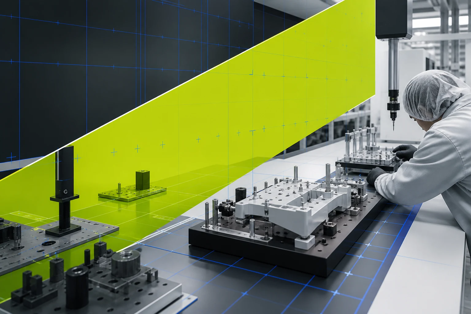
Original artwork establishes the direction's visual language before it is translated into an interface.
03 / Website example
Try the page as a working experience
Explore this responsive page directly inside the catalog. Its primary navigation, controls, and interactions are live; open it full screen to experience the original composition.
Examples are in production
The direction is available now. Its brand websites are being built as independent sites and will appear here during local production.
04 / Fit
Suitable for
Suitable for
enterprise / consulting / technology / b2b / finance / professional services
Business goals
differentiate / explain / sell / recruit
A strong choice when
Strong when enterprise, consulting, technology, b2b need to differentiate, explain, sell through a memorable but repeatable visual system.
Avoid when
Avoid when the brief needs complete visual neutrality or when this direction would compete with essential information and actions.
05 / Design system
Design system
Rules that should remain coherent as content, devices, and business needs change.
- 01Composition
- Disciplined business modules interrupted by one large-scale typographic or spatial move per view.
- 02Hierarchy
- Make the signature move the first organizing decision, then reveal supporting information through stable scale, alignment, and sequence.
- 03Typography
- Custom-feeling grotesque or sharp sans with rational body copy and expressive scale shifts.
- 04Color
- Strong neutral architecture plus an uncommon, owned accent combination tied to business meaning.
- 05Imagery
- Real systems, people at work, or abstracted domain evidence; avoid generic office portraiture.
- 06Material
- Precise rules, indexes, and technical surfaces balanced by one tactile or photographic note.
- 07Motion
- Confident reflow, sectional reveals, and data transitions rather than ambient brand animation.
Adaptation
Keep the signature move invariant. Adapt imagery, material, language, and interaction to the actual enterprise, consulting, technology context rather than copying a finished reference.
Accessibility
Use progressive disclosure, stable alignment, and generous line spacing for dense information. Meet WCAG AA contrast, visible focus, 44px targets, and never encode meaning through color or style alone.
06 / Background
Background
These lineages are source-linked research doors, not permission to copy a particular work or brand.
- 01corporate modernism
- 02swiss punk
- 03new typography
- 04aeg identity
Guardrail
The expressive interruption must encode the company's point of view, not borrowed agency style.
07 / Agent recipe
corporate-avant-ledger
Use the stable ID and recipe to give design agents the same context. Always adapt the output to the real business.
Prompt recipe
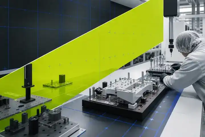
Create one original 3:2 landscape key artwork for the fictional brand Metra Form 17, which makes precision inspection fixtures for medical-device factories. This is the canonical showcase for the Corporate Avant Ledger design direction. Show a coherent real-world scene: a precise metrology and fixture-inspection environment with machined jigs, gauges, modular work surfaces, one anonymous gloved technician, disciplined ledger-like alignment, and one aggressive oversized spatial interruption made from an acid-lime inspection plane crossing a cobalt technical grid. High-end editorial industrial photography combined with physically built graphic wayfinding, credible manufacturing detail, sharp neutral light, graphite, off-white, acid lime, cobalt. One dominant integrated application, readable at thumbnail scale, not a collage or mood board. No readable text, numbers, logo, watermark, real company, medical claim, identifiable face, copied campaign, or imitation of any artist. Keep important content inside an 8 percent safe margin and allow responsive crops.Working constraints
- Use one coherent direction grammar, not a collage of style references.
- Use only a fictional business and minimal exact text.
- Do not imitate a living artist, real brand, client project, or proprietary campaign.
- Preserve essential hierarchy, legibility, contrast, and reduced-motion equivalence.
- Avoid: default blue SaaS.
- Avoid: serif headline plus rounded card stack.
- Avoid: random experimental typography.
08 / Sources & rights
Sources & rights
Work ownerSol
Example licenseAll rights reserved
- 01
Standards Manual(デザインマニュアル復刻版元)
Role: lineage · Linked source retains its own rights; IndexStyle structured description is CC BY 4.0.
- 02
Eye Magazine — Reputations: Wolfgang Weingart
Role: lineage · Linked source retains its own rights; IndexStyle structured description is CC BY 4.0.
- 03
Design Style Book — The New Typography
Role: lineage · Linked source retains its own rights; IndexStyle structured description is CC BY 4.0.
- 04
Victoria and Albert Museum, Arts and Crafts: beyond the UK
Role: lineage · Linked source retains its own rights; IndexStyle structured description is CC BY 4.0.
The choice will be carried into the Quick Brief and can still be removed before sending.
Choose this style