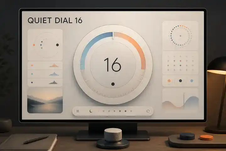
01 / Overview
Feels calm, personal, trust, with a deliberate rather than generic personality.
Signature move
A single living measure expands from glanceable status into a tactile control or explanation.
- Intensity
- quiet
- Versatility
- 5 / 5
- ID
soft-instrument
02 / Example art
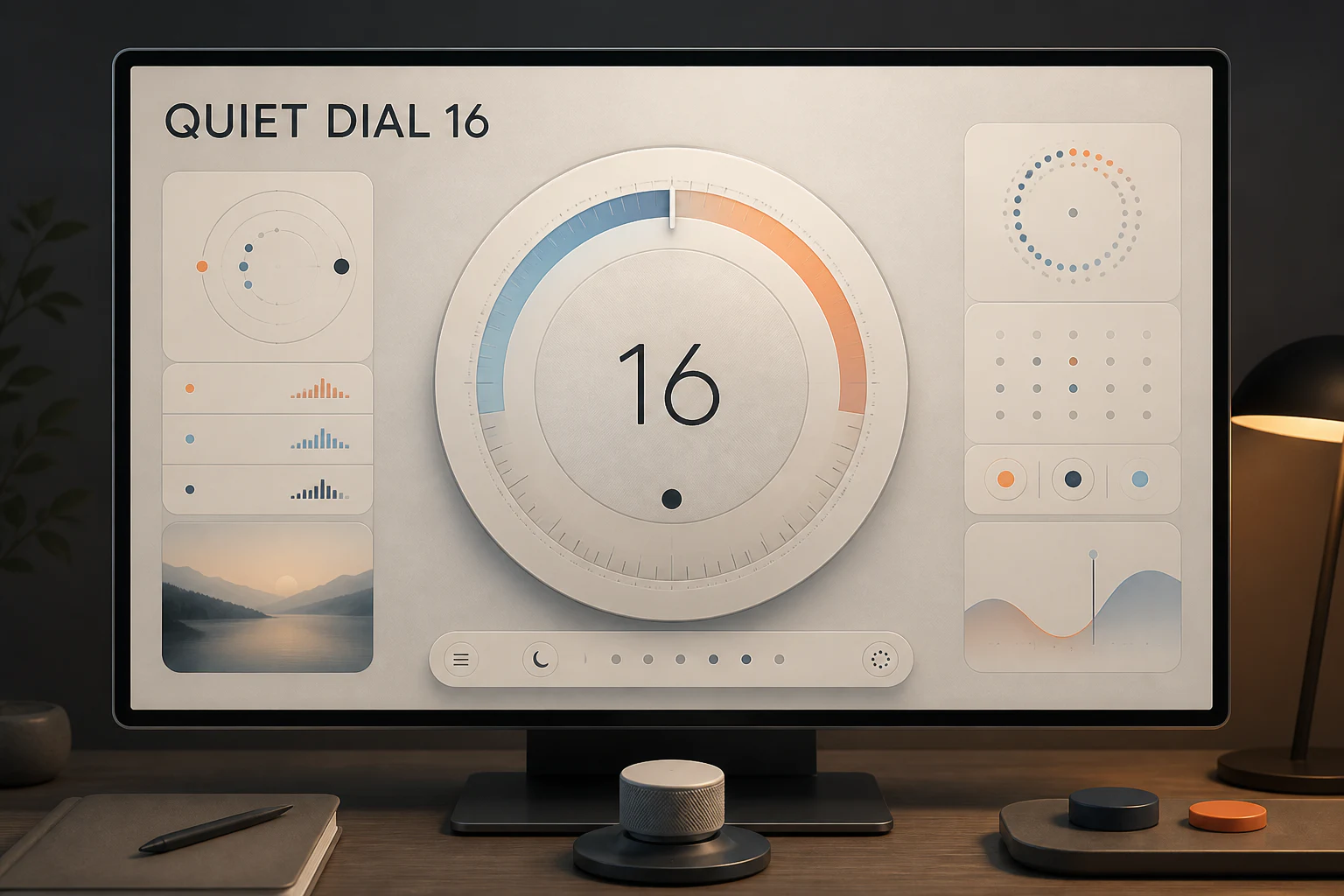
Focus Dial
Original artwork establishes the direction's visual language before it is translated into an interface.
03 / Website example
Try the page as a working experience
Explore this responsive page directly inside the catalog. Its primary navigation, controls, and interactions are live; open it full screen to experience the original composition.
Interactive page
What you can try
- Overview: A working Focus Dial timer workspace.
- Workspace: Timer objects, views, and outputs.
- Workflows: Task handoffs for repeatable digital work.
- System: Local boundaries, roles, and support.
- Plans: Operating fit and included support.
- Configure: Configure a timer workspace.
04 / Fit
Suitable for
Suitable for
healthcare / wellness / productivity / smart home / personal finance
Business goals
monitor / adjust / reassure / habit
A strong choice when
Strong when healthcare, wellness, productivity, smart home need to monitor, adjust, reassure through a memorable but repeatable visual system.
Avoid when
Avoid when the brief needs complete visual neutrality or when this direction would compete with essential information and actions.
05 / Design system
Design system
Rules that should remain coherent as content, devices, and business needs change.
- 01Composition
- One dominant measure, quiet secondary controls, generous breathing room, and stable zones.
- 02Hierarchy
- Make the signature move the first organizing decision, then reveal supporting information through stable scale, alignment, and sequence.
- 03Typography
- Warm humanist sans with clear numerals and sentence-case guidance.
- 04Color
- Soft neutrals with calibrated cool and warm signals; never a monochrome wellness wash.
- 05Imagery
- Rare, intimate, and functional; prefer meaningful diagrams or personal context to lifestyle stock.
- 06Material
- Matte translucent layers and soft tactile controls with crisp boundaries and accessible contrast.
- 07Motion
- Breathing but precise state changes, reduced-motion equivalents, and no ambient distraction.
Adaptation
Keep the signature move invariant. Adapt imagery, material, language, and interaction to the actual healthcare, wellness, productivity context rather than copying a finished reference.
Accessibility
Preserve a visible reading order and sufficient working space. Provide an equivalent reduced-motion state. Meet WCAG AA contrast, visible focus, 44px targets, and never encode meaning through color or style alone.
06 / Background
Background
These lineages are source-linked research doors, not permission to copy a particular work or brand.
- 01ulm school
- 02humanist sans
- 03light and space
- 04pictogram system
Guardrail
Do not imply clinical certainty where the product provides only guidance or estimates.
07 / Agent recipe
soft-instrument
Use the stable ID and recipe to give design agents the same context. Always adapt the output to the real business.
Prompt recipe
Use case: stylized-concept
Asset type: Aesthetic Directions Encyclopedia showcase, 3:2 landscape master
Primary request: Create one polished freeform showcase for Soft Instrument, applied to QUIET DIAL 16, a clearly fictional focus and planning application.
Scene/backdrop: a quiet digital workspace on a precision desktop display with one central planning instrument and restrained physical controls.
Style/medium: A coherent contemporary design world, not a collage of references. Give personal data and daily controls the confidence of an instrument panel without clinical coldness.
Composition/framing: One dominant measure, quiet secondary controls, generous breathing room, and stable zones. Keep all important content inside an 8 percent safe margin.
Typography: Warm humanist sans with clear numerals and sentence-case guidance.
Color palette: Soft neutrals with calibrated cool and warm signals; never a monochrome wellness wash.
Imagery: Rare, intimate, and functional; prefer meaningful diagrams or personal context to lifestyle stock.
Materials/textures: Matte translucent layers and soft tactile controls with crisp boundaries and accessible contrast.
Text (verbatim): "QUIET DIAL 16". No other readable words.
Constraints: Original fictional concept; visibly applied to ui, website; realistic production detail; no real company, client, result, claim, signature, or watermark; no imitation of a living artist or proprietary campaign.
Avoid: pastel wellness sameness, medical alarm color for ordinary states, ornamental glass panels, real logos, watermarks, artist imitation, generic mood board, illegible filler text.
Pilot refinement: Make one dominant integrated real-world application readable at thumbnail scale. Secondary views may support it but must remain subordinate. Do not create an equal-weight tiled mood board or generic presentation collage unless sequencing is essential to the direction. Render the exact requested text correctly and do not invent other readable copy.
Working constraints
- Use one coherent direction grammar, not a collage of style references.
- Use only a fictional business and minimal exact text.
- Do not imitate a living artist, real brand, client project, or proprietary campaign.
- Preserve essential hierarchy, legibility, contrast, and reduced-motion equivalence.
- Avoid: pastel wellness sameness.
- Avoid: medical alarm color for ordinary states.
- Avoid: ornamental glass panels.
08 / Sources & rights
Sources & rights
Work ownerSol
Example licenseAll rights reserved
- 01
HfG-Archiv Ulm
Role: lineage · Linked source retains its own rights; IndexStyle structured description is CC BY 4.0.
- 02
V&A — Edward Johnston レタリング原図
Role: lineage · Linked source retains its own rights; IndexStyle structured description is CC BY 4.0.
- 03
The Art Story — Light and Space
Role: lineage · Linked source retains its own rights; IndexStyle structured description is CC BY 4.0.
- 04
AIGA — Symbol Signs
Role: lineage · Linked source retains its own rights; IndexStyle structured description is CC BY 4.0.
The choice will be carried into the Quick Brief and can still be removed before sending.
Choose this style